Color season
Bright Springin color analysis: the palette, and how to know if it's you
Bright Spring color analysis: clean, warm, vivid color that lights you up.
Bright Spring is the warm, high-chroma season: clean, saturated color at medium-high contrast. Coral, turquoise, grass green and hot pink light the face up, while dusty tones, earthy brown and greyed pastels drain it. Bright gold is the metal, and ivory replaces pure black.
The four dimensions
Every season is defined by four objective axes. They are what TOP measures — never a guess.
Your palette
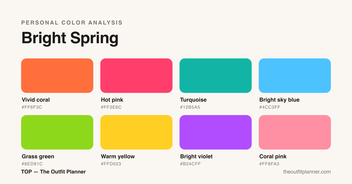
The season's character
Bright Spring sits at the clearest, most vivid point of the warm side. Skin with glow, medium-high natural contrast, and eyes that often carry their own light. Muddy or dusty tones dull that freshness — clean, saturated color is what suits you.
How to recognize
You're likely a Bright Spring if vivid colors make you glow instead of overpowering you: a strong coral or turquoise seems to light up your face. Your skin has a glow and a warm-golden base, your eyes are often clear and luminous (green, hazel, crystalline blue) and the natural contrast between hair, skin and eyes is medium to high. In muted beige or dusty grey, your face fades before the outfit does.
How to combine
Build looks around one clean, strong color at a time — coral with denim, turquoise with warm white — and let light neutrals play backup. Contrast helps: a light piece with a vivid one beats two muted mid-tones. Avoid stacking many muddy colors together; your strength is crispness.
The palette in real life
At work
Bright Spring in the workplace calls for controlled vibrancy — not toned down, but purposeful. Your palette carries natural authority when you keep the palette anchored and intentional. First combination: a tailored blazer in bright sky blue paired with ivory trousers and coral pink flats. The blue reads as confident and polished without veering corporate-cold. Second combination: a grass green midi dress with nude-adjacent warm yellow accessories — a slim belt, simple earrings — keeps the silhouette clean while your color analysis signature does the heavy lifting. Third combination: a vivid coral blouse tucked into wide-leg cream trousers with a structured bag in turquoise or warm yellow. This is the power move for client-facing days. What to avoid: muted, dusty, or smoky tones — anything ash, camel, or gray-beige will wash you out under fluorescent lighting and compete poorly with your natural contrast. Soft palettes borrowed from Soft Autumn or Soft Summer simply don't match your high-chroma, high-contrast profile. Also avoid black-and-white only looks; they flatten the warmth that is central to Bright Spring. Keep one anchor color bold and balance with lighter coordinates.
At parties and events
Party dressing for Bright Spring color analysis is where your palette becomes genuinely spectacular. The combination of warmth, clarity, and high contrast means you can carry saturated, luminous fabrics that would overwhelm other seasons. For a formal event: a floor-length dress in vivid coral or hot pink with gold jewelry — the warm metal amplifies rather than fights your natural undertone. Turquoise is another standout option for evening; paired with bright violet accessories or shoes, it creates the kind of high-contrast dynamic that defines your palette. For cocktail events: a bright sky blue jumpsuit with coral-pink statement earrings and warm gold strappy heels. If you prefer separates, a hot pink satin skirt with a fitted grass green top is bold but entirely within your season. One rule to live by: choose one dominant Bright Spring color as your hero and keep the rest of the look in the palette's lighter range — coral pink, warm yellow, or bright sky blue as accents. Metallic choices should stay warm: gold, rose gold, or champagne. Avoid silver, which pulls cool and slightly mutes your glow.
Day to day
Casual dressing for Bright Spring means leaning into ease without losing the energy your coloring naturally projects. A go-to everyday combination: grass green straight-leg jeans with a warm yellow relaxed tee and white sneakers with warm undertones. This feels effortless but is distinctly you. For a weekend run: vivid coral linen trousers with a bright sky blue striped top — fresh, warm, and seasonally coherent. When layering for cooler days, a turquoise denim jacket over a coral pink dress gives you depth without losing the warmth. If you reach for neutrals, the Bright Spring neutrals are warm: cream, ivory, warm white, and camel-adjacent light tones (use sparingly). The palette's rule of thumb for casual dressing: at least one piece per outfit should be a full Bright Spring color. A monochrome look in hot pink or grass green is entirely appropriate and reads as intentional rather than loud. Avoid the trap of retreating into black and gray for 'easy' dressing — those shades disconnect from your color analysis profile and visually drain your complexion.
The season's capsule wardrobe
A Bright Spring capsule works because the palette is inherently versatile at high saturation. The ten pieces below cover work, weekend, and event dressing without duplication of function. The logic is layering: each item pairs with at least three others in the set. Bright Spring color analysis gives you a rare advantage — the colors are distinct enough that even simple outfits read as composed. The goal is a wardrobe where nothing sits unused because every piece belongs to the same warm, clear, high-contrast family. Ten pieces is enough because the palette itself does the coordination.
- Vivid coral blazer — the anchor layering piece that elevates any trouser or skirt combination into a full look.
- Grass green straight-leg trousers — a statement bottom that pairs with four of the remaining nine pieces.
- Bright sky blue silk blouse — the workweek workhorse; tuck into trousers or wear open over a dress.
- Hot pink midi dress — the single hero dress; covers cocktail events and elevated casual equally well.
- Turquoise denim jacket — the casual layer that adds Bright Spring warmth to any outfit without effort.
- Warm yellow linen wide-leg trousers — weekend ease with enough chroma to hold its own as a standalone statement.
- Coral pink fitted knit top — the neutral bridge; pairs down to jeans or up to the green trousers.
- Ivory tailored trousers — the closest thing to a neutral base; warm enough to stay within the palette.
- Vivid coral sneakers or flats — footwear that ties back into the palette without competing with the top half.
- Bright violet structured bag — the accessory anchor; introduces the palette's accent color without requiring more garments.
Makeup, hair and accessories
Bright Spring color analysis extends naturally into beauty choices, and getting this right multiplies the effect of your wardrobe. For lips: warm corals, hot pinks, and peachy-warm reds are your range — think living coral, warm rose, and fuchsia with a golden base. Cool berries and blue-reds work against your warmth and create a disconnect between face and clothing. Blush follows the same logic: peach-coral and warm rose applied with a light hand give the 'lit from within' look that matches your natural brightness. Avoid muted mauves or cool pinks. For eyes: warm golds, peachy champagne, and soft turquoise as accent shades work with your clarity. Smoky grays and cool taupes flatten the contrast that defines your color analysis profile. Brow tones should stay warm — golden brown, warm brunette. Avoid ash or cool ash-brown. For hair: your season supports warm golden blondes, strawberry blondes, warm light browns, and copper. Coloring toward ash, platinum, or cool brown works against the warmth that distinguishes Bright Spring from its neighbor Bright Winter. Accessory metals: gold and warm rose gold. Silver is a Bright Winter and True Winter choice — on you it reads slightly cold. Sunglasses frames in warm tortoise, gold, or vivid coral complement the palette. The general rule: if it has a warm, clear, luminous quality — it belongs.
Neighboring seasons on the wheel
Still torn between seasons?
Bright Spring vs. Bright Winter: warmth is the dividing line
Bright Spring and Bright Winter share high clarity and high contrast — both seasons can carry vivid, saturated color without looking costumey. The difference is temperature. Bright Winter is cool-neutral to cool; Bright Spring is warm. To test which side you fall on, hold a pure cool fuchsia (bluish-pink) next to a warm coral-pink close to your face. If the fuchsia brightens your eyes and the coral looks slightly orange against your skin, you lean Bright Winter. If the coral-pink warms your complexion and the fuchsia feels clinical or harsh, you are Bright Spring. Another practical test: hold a true turquoise with yellow-green bias (warm) versus a turquoise with blue-green bias (cool). Bright Spring harmonizes with the warmer version. The TOP app measures the undertone of each piece from a photo, which can clarify close calls. In terms of wardrobe overlap: both seasons share vivid violet and bright sky blue. The distinction shows up in lip color and hair — Bright Winter favors cool berry lips and ash-toned hair, while Bright Spring reaches for warm coral lips and golden or copper tones.
Bright Spring vs. Warm Spring: clarity separates the two
Warm Spring and Bright Spring are both warm seasons, but they differ on saturation and contrast. Warm Spring sits lower in chroma — its palette is warm and golden but softer, more sun-faded. Bright Spring carries the same warmth but adds intensity and contrast. The practical test: hold a true vivid coral (fully saturated) next to a peachy muted coral near your face. If the vivid coral makes your skin look luminous and your eyes pop, you belong to Bright Spring. If it overwhelms and the muted peachy version feels more harmonious, Warm Spring is your season. Another test: bright grass green. Warm Spring finds it slightly aggressive; Bright Spring wears it naturally because the high contrast supports high saturation. In wardrobe terms, both seasons share warm yellows and coral tones, but Warm Spring maxes out around medium saturation while Bright Spring can go all the way to maximum chroma. If you find soft, warm, low-contrast looks beautiful in theory but slightly flat on you, Bright Spring is almost certainly the answer.
Torn between this one and a neighbour?
The two comparisons between this season and the ones it borders: the measurement that splits them, the home tests and what the wrong choice costs.
Frequently asked questions
How do I know if I'm a Bright Spring?
Test clean, vivid colors near your face in daylight: if coral, turquoise and grass green light you up while dusty tones dull you, that's a strong sign. TOP measures this from a photo, no guessing.
Can a Bright Spring wear black?
Pure black tends to harden and mute your warm glow. Prefer warm navy, warm grey or dark brown as your dark neutral, and keep black to accessories away from the face.
What's the difference between Bright Spring and Bright Winter?
Both are high chroma and high contrast, but Bright Spring is warm (golden base) and Bright Winter is cool (blue base). They meet on the wheel through brightness — temperature is what separates them.
What hair color works best for Bright Spring?
Bright Spring color analysis is most flattered by hair in the warm, clear range: golden blonde, strawberry blonde, warm light brown, copper, and auburn with warm tones. These shades reflect the season's defining qualities — warmth and clarity. If you color your hair, avoid cool or ash tones (ash blonde, platinum, cool brown) because they introduce a coolness that competes with your undertone. Highlights should be warm gold or copper, not icy. If you are a natural brunette testing the season, a few warm golden or copper face-framing highlights will immediately confirm whether the warmth belongs to you.
Can Bright Spring wear black?
Black is technically outside the Bright Spring palette, which runs warm and clear rather than cool and dark. Pure black can create a disconnect — it pulls cooler than your undertone and can make your complexion appear less luminous next to the face. That said, black worn away from the face (trousers, shoes, a bag) causes minimal interference. The better strategy is to use the darkest shades within your own palette: deep vivid coral, rich grass green, or dark turquoise function as your 'dark anchor' without the temperature conflict. If you love black, pair it with a Bright Spring color at the neckline so your face stays in the warm, high-contrast zone that suits you.
Hair × season
Hair color for this season
Which natural tone fits, which dyes flatter and what to avoid — in season-specific detail.
Hair color — Bright Spring →Eyewear × season
Eyewear and frames for this season
Which shape, material, frame colour and lens suit you — and what to avoid — in season-specific detail.
Eyewear and frames — Bright Spring →Denim × season
Jeans and denim for this season
Which wash, cut, hardware and topstitch suit you — and what to avoid — in season-specific detail.
Jeans and denim — Bright Spring →Nail polish × season
Nail polish for this season
Which shade, finish, nail shape and effect suit you — and what to avoid — in season-specific detail.
Nail polish — Bright Spring →Jewelry × season
Jewelry and metals for this season
Which metal, stone, pearl and finish suit you — and what to avoid — in season-specific detail.
Jewelry and metals — Bright Spring →Lipstick × season
Lipstick and makeup for this season
Which red, which nude, which blush and which finish suit you — and what washes the face out — in season-specific detail.
Lipstick and makeup — Bright Spring →By weather
Your season in every weather
The coat, the white and the third piece change with the thermometer — here is how this palette handles each one.
Find your season in the app
TOP measures your color from a photo and scores every piece in your closet by your palette. Free to start.
Download on the App Store Get it on Google Play