Color season
Cool Summerin color analysis: which cool blue lights you up, and which one flattens you
Cool Summer color analysis: true, serene cool with no warmth.
Cool Summer is true cool at medium depth: blues, pinks and greens over a blue base, with no warmth at all. Soft navy, cool pink, light plum and greyed emerald suit it; orange, gold and warm earth tones break it apart. Silver is the metal, and grey replaces black.
The four dimensions
Every season is defined by four objective axes. They are what TOP measures — never a guess.
Your palette
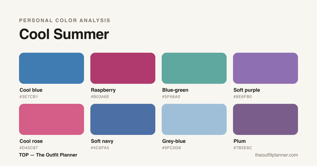
The season's character
Cool Summer is the cool heart of summer: cool temperature dominates, with medium-low chroma. Medium, soft contrast. Cool pinks and blues light you up; any warmth turns the skin sallow.
How to recognize
Cool Summer is serene cool: skin with a rosy or bluish base, cool-brown to greying hair and cool eyes (blue, grey). Clearly cool temperature, medium contrast and medium-low chroma. The clearest sign is what warmth does to you: gold and orange turn the skin dull and sallow instantly.
How to combine
Stay in cool tones of medium intensity — cool blue, raspberry, plum — paired with each other or a cool neutral. Soft contrasts flatter more than hard black-and-white. Silver is the right metal.
Cool blue: what that blue actually is, and how to know if it's yours
Cool blue is blue with blue underneath it — not a drop of yellow in the base. In the Cool Summer palette it is #3E7CB1: a serene, medium-depth blue sitting between washed denim and navy. It is the season's signature colour because it hands the skin back exactly the temperature it asks for.
What separates a cool blue from a warm blue
Every blue looks cool until you put two side by side. Warm blue — turquoise, pool blue, greenish teal — hides green or yellow in its base and pulls the skin towards gold. Cool blue pulls towards pink: it is the blue of lapis lazuli, of raw denim, of tailoring navy. When in doubt, judge it against a neighbour: lay the fabric on a pure grey. If the blue reads greenish next to the grey it is warm; if it reads faintly violet, it is cool.
The ten-second test, by the window
Take two blue garments into natural light, with no makeup on. Hold one at a time under your chin and look at your face, not at the fabric. The right cool blue switches the eyes on and softens the shadow under them; the wrong blue yellows the base of the neck and pushes every line forward. If both look identical, the gap between them is too small — swap one for a light turquoise and run it again.
What to wear cool blue with
In Cool Summer, cool blue is a neutral and a colour at once: it carries a whole outfit without asking for help. The pairings that work are raspberry (#B03A6E) for contrast, grey-blue for work, cool rose for everyday and silver at the wrist. What breaks it is gold, camel and any warm earth tone — they fight the blue base and hand the skin back a yellow this season does not have.
If cool blue suits you but turquoise does too, your season may be Light Summer or Soft Summer rather than Cool Summer. The TOP app reads each garment's undertone from a photo and tells you which of the blues in your wardrobe is genuinely cool.
The palette in real life
At work
Cool Summer in the workplace is about understated precision. The palette's cool undertone and medium value deliver authority without visual noise. Three combinations that work: First — soft navy tailored trousers with a cool rose blouse and grey-blue blazer. The result reads considered and polished without being stiff. Second — plum pencil dress with a grey-blue light coat and cool-toned black heel. The plum grounds the look while the grey creates coherence. Third — cool blue blazer and skirt set with a lighter grey-blue shirt underneath. Texture and tone variation do the work without adding a third color. What to avoid: orange, caramel, warm brown, and warm beige — all of these fight the skin's cool undertone and visually drain the face. Pure white and bright yellow are also risky — the high contrast does not suit the medium value characteristic of Cool Summer color analysis. When you need a light neutral, choose cool off-white or very light grey. For jewelry and accessories, silver and platinum are always the right call in a professional setting.
At parties and events
For parties and events, Cool Summer can go further without losing its identity. The core rule: depth over sparkle. A long plum or raspberry dress already delivers what other seasons need gold to achieve. Combinations that work: A midi dress in soft purple with thin-strap silver sandals — coordinated and effortlessly elegant. Raspberry and cool blue separates with a matte silver clutch — for those who prefer personality in their evening looks. A cool blue gown with long silver earrings and a smoked soft-purple eye — the cool metal amplifies the palette without competing with it. The key rule for Cool Summer at events: avoid gold and bronze. They introduce warmth where none exists in your color analysis, and the result is a dissonance that is hard to name but easy to feel. Aged silver, platinum, and white-gold are the metals of this season. A single touch of icy sparkle — a crystal or cool-toned stone — elevates any party look without leaving the natural territory of Cool Summer.
Day to day
Day-to-day dressing is where Cool Summer's specificity really pays off. Cold-wash jeans with a blue-green top and cool-toned white sneakers — the most versatile outfit the palette offers. Grey-blue sweatshirt with soft purple knit trousers — comfort that stays chromatically coherent. Cool rose T-shirt with a cold-wash denim jacket and short cool black boot — works for any informal occasion. The pocket rule for Cool Summer casual: every time you reach for a neutral, ask whether it is cool or warm. Beige and camel feel safe but visually dim a face with a cool undertone. Grey, grey-blue, and soft navy are the neutrals that actually work for this season in color analysis. Silver accessories complete any casual look without effort. For bags and shoes, lean into the cool neutrals of the palette — a cool grey or soft navy leather lasts years and pairs with everything in the capsule.
The season's capsule wardrobe
A Cool Summer capsule does not need many pieces — it needs the right ones. The logic of this season is coherence: because the palette already carries its own depth, ten well-chosen items cover work, events, and casual without gaps or redundancy. Each piece was selected to work with at least three others on the list, multiplying outfit options without expanding the wardrobe. The selection rule was simple: nothing warm makes the cut. Not out of rigidity, but because a single warm-toned piece breaks the harmony of the whole. This capsule is the foundation — from it, each person expands according to what Cool Summer color analysis calls for at each stage of their life.
- Grey-blue blazer — the structured neutral that anchors both work and casual looks.
- Soft navy tailored trousers — replaces black with more harmony for this season's undertone.
- Plum midi dress — an event piece that also works in the office paired with the blazer.
- Cool rose blouse — the most versatile tone in the palette, pairs with every cool neutral.
- Cool blue shirt — functions as both a neutral and a color source within the capsule.
- Soft purple pencil skirt — work or event separates, pairs with the shirt and the blazer.
- Cold-wash denim jacket — the casual layer that keeps the cool undertone grounded on weekends.
- Blue-green knit — a color detail for casual, texture that varies without leaving the palette.
- Cool grey straight trousers — the light neutral of the capsule, receives the medium and dark tones well.
- Raspberry long dress — the statement piece, for events where Cool Summer can show up fully.
Makeup, hair and accessories
Cool Summer makeup follows the same principle as the palette: cool, medium, harmonious. For lips, the most flattering tones are raspberry, light plum, cool rose, and mauve — avoid coral, orange, and warm nude, which create dissonance visible even at a distance. The ideal blush is cool pink or soft mauve, applied with a light hand — Cool Summer color analysis does not need much to appear. For eyeshadow, smoked soft purple, blue-grey, and cool blue outperform brown and bronze. For intensity, smoked plum with dark navy liner does more for this season than any warm black. For hair, the most flattering tones are ash blonde, cool brown with grey or lilac highlights, and blue-black. What dulls the face: dyes with an orange, copper, or golden base — they conflict with the skin's cool undertone and create a visual fatigue that no makeup corrects. For metals, the rule is firm: silver, platinum, and cool rose gold. Warm gold and bronze stay out. For glasses frames, grey-blue, raspberry, soft purple, and silver are the best choices. The general rule for Cool Summer beauty: anything that reads warm will dim the face. When in doubt, always choose the cooler option.
Neighboring seasons on the wheel
Still torn between seasons?
Cool Summer vs. Light Summer: which one are you?
The difference between Cool Summer and Light Summer is about value and intensity, not undertone — both are cool, but Light Summer calls for lightness while Cool Summer can hold depth. The practical test: hold a medium soft purple and a pale lavender next to your face. If the pale lavender illuminates and the medium soft purple feels heavy, you are likely Light Summer. If the medium soft purple sits naturally and the pale lavender looks washed out or too young, you are Cool Summer. Another concrete comparison: soft saturated navy. In Cool Summer it works as a grounding neutral. In Light Summer it can feel heavy and cast unwanted shadows on the face. Light Summer works best with the pastel versions of cool tones — baby blue, pale orchid pink, light mint. Cool Summer prefers the medium-value versions of those same tones. The TOP app measures the value and undertone of each garment from a photo, which helps identify which tones in your actual wardrobe belong to which neighbor in the Summer family.
Cool Summer vs. Soft Summer: where is the line?
Cool Summer and Soft Summer share medium value, but they differ in chroma and dominant undertone. Soft Summer leans neutral — its colors are more grayed-down, less definitively cool, with a softness that borders warm without crossing into it. Cool Summer is cleaner in its undertone: the cool quality is perceptible and colors can carry slightly more saturation. The test: hold a pure cool rose and an ashy mauve-rose next to your face. If the pure cool rose makes the skin look clean and the eyes sharper, you are Cool Summer. If it feels slightly strong and the ashy mauve is gentler on the face, you may be Soft Summer. In wardrobe terms, Soft Summer tolerates cool earthy tones — like ashy khaki — better than Cool Summer, where those tones tend to produce too little contrast. Cool Summer reads more clearly in pure cool blue and raspberry than Soft Summer, which prefers hazier versions of those same tones.
Torn between this one and a neighbour?
The two comparisons between this season and the ones it borders: the measurement that splits them, the home tests and what the wrong choice costs.
Frequently asked questions
How do I know if I'm a Cool Summer?
If cool tones light you up and any warmth turns you sallow, with medium, soft natural contrast, it's a strong sign of Cool Summer. TOP measures the cool temperature from a photo, with light correction.
Can a Cool Summer wear black?
Pure black can be too hard; cool navy and charcoal usually flatter more. If you wear black, bring a cool pink or blue near the face to soften it.
What's the difference between Cool Summer and Cool Winter?
Both are cool, but Cool Summer is softer (medium-low chroma) and Cool Winter is more vivid and high-contrast. Same temperature, different intensities.
What hair color is best for Cool Summer?
The most flattering tones for Cool Summer color analysis are ash or pearl blonde, cool brown with grey or lilac highlights, and blue-based black. For those with natural white hair, the result is often very harmonious — cool white is one of the best neutrals in this season's palette. What to avoid without exception: dyes with a warm base such as copper, orange red, golden blonde, or caramel. These tones introduce warmth where the skin's undertone calls for cool, and the result is a visual fatigue that makeup cannot fix. If you want to lighten your hair, look for techniques that create ashy or silver reflections — cool babylights or a cool-toned balayage.
Can Cool Summer wear black or red?
Pure black can work, but it requires thought. Cool Summer has medium-low contrast, so high-contrast black close to the face — especially in high necklines — can read harsh. The solution is to move it away from the face with layers, or replace it with soft navy as a more harmonious anchor. Red is the most debated color for this season. Warm red, orange-red, and terracotta are outside the palette and will clash with the skin's cool undertone. But a blue-based red — like deep raspberry or cherry red — can work because it preserves the cool quality. The practical rule: if the red has yellow or orange at its base, avoid it. If it reads as a red-purple or red-raspberry, it can be included with restraint.
Hair × season
Hair color for this season
Which natural tone fits, which dyes flatter and what to avoid — in season-specific detail.
Hair color — Cool Summer →Eyewear × season
Eyewear and frames for this season
Which shape, material, frame colour and lens suit you — and what to avoid — in season-specific detail.
Eyewear and frames — Cool Summer →Denim × season
Jeans and denim for this season
Which wash, cut, hardware and topstitch suit you — and what to avoid — in season-specific detail.
Jeans and denim — Cool Summer →Nail polish × season
Nail polish for this season
Which shade, finish, nail shape and effect suit you — and what to avoid — in season-specific detail.
Nail polish — Cool Summer →Jewelry × season
Jewelry and metals for this season
Which metal, stone, pearl and finish suit you — and what to avoid — in season-specific detail.
Jewelry and metals — Cool Summer →Lipstick × season
Lipstick and makeup for this season
Which red, which nude, which blush and which finish suit you — and what washes the face out — in season-specific detail.
Lipstick and makeup — Cool Summer →By weather
Your season in every weather
The coat, the white and the third piece change with the thermometer — here is how this palette handles each one.
Find your season in the app
TOP measures your color from a photo and scores every piece in your closet by your palette. Free to start.
Download on the App Store Get it on Google Play