Color season
Light Neutralin color analysis: the palette, and how to know if it's you
Light Neutral color analysis: the border between Light Spring and Light Summer.
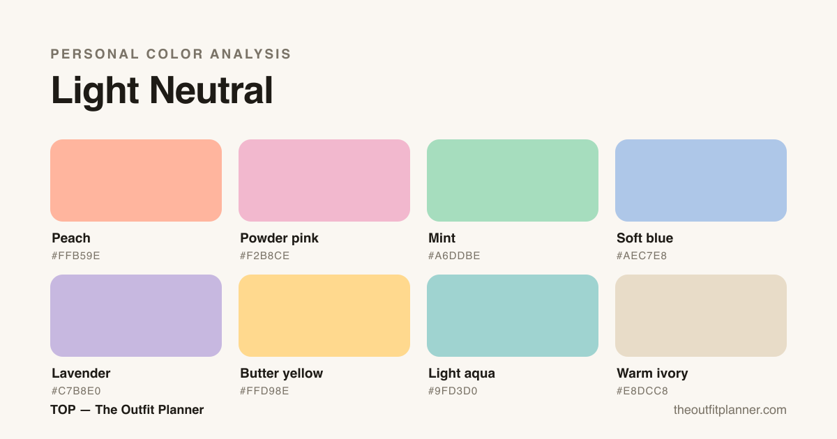
Light Neutral is the border between Light Spring and Light Summer: neutral temperature, light depth and low contrast. Mid-way pastels — quartz pink, light blue, aqua and pale camel — work on both sides; heavy darks and saturated color do not. Light gold and silver both work.
The four dimensions
Every season is defined by four objective axes. They are what TOP measures — never a guess.
Your palette
The season's character
Light Neutral is for those who live on the border between Light Spring and Light Summer — neither warm nor cool enough to pin one side. Instead of forcing the choice, TOP gives you the best of both neighbors, at your lightness. High value, medium chroma, low contrast.
How to recognize
You lean Light Neutral when you're light and low-contrast, but neither the warm nor the cool test pins a side — both almost work. Fair skin with an ambiguous base, light hair and eyes. It's the border between Light Spring and Light Summer, and TOP delivers the palette that takes the best of both.
How to combine
Stay in light pastels and let the temperature stay fluid — peach and soft blue coexist well in your palette. Keep contrast low. As a neutral, both light gold and silver work; choose by the look, not by a rule.
The palette in real life
At work
At the office, Light Neutral color analysis builds light uniforms that carry a full week without tiring the face. Three combinations you can wear tomorrow. First: a soft blue shirt tucked into warm ivory tailored trousers with powder pink flats — the professional version that reads as calm authority without hardening the eyes. Second: a powder pink blouse under a lavender blazer with light beige trousers; lavender replaces black with much more kindness toward your lightness. Third: a soft blue midi dress with a butter yellow cardigan for the days the office air conditioning insists on being winter. The border advantage shows up in practice — on Monday you lean warm with peach, on Wednesday cool with light aqua, and everything still talks to everything else, because the whole palette lives at the same light value and medium chroma. The mistake to avoid is the usual one for light seasons: retreating to black "to look professional." Pure black flattens your natural contrast and drains the face under fluorescent light — swap it for warm ivory or a very light pearl grey. Optic white also weighs; prefer off-white or ivory, which brighten without shouting.
At parties and events
For parties, forget the rule that events call for dark color: your impact lives in luminous lights. A long powder pink dress with light gold sandals and delicate pearl earrings carries a whole daytime wedding. For dinner, a mint co-ord in a fluid fabric with a peach clutch delivers energy effortlessly. For an evening event, peach silk with an ivory belt and light beige shoes brings the soft glamour that Light Spring and Light Summer share on the border where you live. Lavender in a satin-finish fabric — satin, heavy silk — is your Light Neutral color analysis statement look: it glows without mirror-shining, luminous without competing with the face. If you want depth without going dark, build interest with texture: ivory lace, soft blue pleats, simple-cut lavender velvet. Avoid black sequins or icy silver, which create a contrast your palette doesn't ask for. A single light-metal accent — a thin chain, a small earring — closes the look. And if the dress code demands black, break it at face level with a powder pink scarf or a butter yellow wrap.
Day to day
Day to day, the palette becomes well-solved basics: a light aqua tee with light-wash jeans and warm white sneakers, a butter yellow knit over a warm ivory shirt for cool days, a loose soft blue dress with flat powder pink sandals for the weekend. Peach and mint work as accent colors on sneakers, caps, bags and scarves — let the metal (light gold or polished silver, both serve you) run the show. Since you live in the middle of the border, you can mix "spring" and "summer" pieces in the same outfit effortlessly — it's the most flexible wardrobe among the light seasons. For travel, an oversized warm ivory knit with light beige joggers fits every climate and doesn't crease. For working from home, a powder pink or light aqua sweatshirt with beige trousers always looks more intentional than black or dark grey. The practical Light Neutral rule is the same as color analysis in general: at least one piece per outfit has to be a full palette color. A monochrome look in powder pink or soft blue is entirely appropriate and reads as intentional, not as running out of options.
The season's capsule wardrobe
A Light Neutral capsule is born from flexibility: everything light, everything combinable, temperature fluid. These thirteen pieces use only colors from your color analysis palette and cross into dozens of outfits — from work to the weekend — without ever forcing you to choose between the warm and the cool side. The logic is layering: each piece pairs with at least three others in the set, and the palette does the coordination on its own because the light value and low contrast guarantee harmony across any pair. Buying rule: if a piece already yields five outfits with what you own, it's in; if it needs one specific palette companion to function, plan the pair from the cart, otherwise it turns into money parked in the closet.
- Cotton shirt in soft blue — the wildcard base that plays office shirt and open layer over a tee
- Silk blouse in peach — the warm accent that brightens the face without shouting
- Light knit in mint — the most versatile point of color, matches ivory, light denim and beige
- Blazer in warm ivory — the work foundation, kinder than black or grey
- Midi dress in powder pink — covers parties, dinners and daytime weddings
- Flowy skirt in lavender — the palette's statement in an easy-to-wear form
- Cardigan in butter yellow — a soft layer that warms any look without hardening
- T-shirt in light aqua — effortless color near the face on any given day
- Tailored trousers in warm ivory — replaces black with far more harmony
- Light-wash jeans — the season's casual base, skip deep indigo
- Silk scarf in powder pink — the finishing touch that ties the neutrals and reinforces color near the face
- Warm ivory or white flats — neutral footwear that doesn't pull temperature cold
- Structured bag in peach or lavender — accessory anchor that introduces color without needing more garments
Makeup, hair and accessories
In makeup, Light Neutral asks for lightness: luminous skin in low-coverage foundation with a warm-neutral undertone, blush in peach or powder pink — both work, switch by the look — and lips in rosy nude or soft coral, always in creamy or balm finish. No deep wine or dark brown: they weigh too much for your light value and create a disconnect between face and clothing. Eyeshadow in warm ivory, rose and lavender follows without weight; light brown eyeliner is kinder than black and respects the low contrast of Light Neutral color analysis. For evening, a lavender smoky eye with a powder pink mouth closes the look without breaking the palette. Brown mascara before black. For hair, keep the lightness: beige blonde, light honey and lifted light brown respect your low contrast, while very dark roots harden the whole picture. Highlights should follow the "one lighter tone or one warm nuance" logic, never icy platinum or closed-down black. In accessories, the border neutral's classic advantage: light gold and polished silver work equally well, and two-tone pieces become almost a uniform. Pearls and milky stones — rose quartz, aquamarine, mother-of-pearl — speak directly to the palette and finish any outfit. Glasses frames in light tortoise, light gold or ivory acetate before any rectangular black. Nail color lands perfectly in powder pink, soft peach or neutral nude; closed-down red and black weigh things down. Perfume: light florals, soft citrus, cotton candy, white tea — the bright-day cues match your register.
Blends the best of:
Still torn between seasons?
Light Neutral or Light Spring?
Both color analysis seasons share the light value and low contrast — the difference is temperature. Light Spring has a clearly golden base: peach and light yellow light you up instantly, while cool tones leave the skin flat. In Light Neutral, the test won't settle: peach and powder pink work almost the same, light gold and polished silver tie in accessories. Compare both metals on your wrist, in natural light, and peach against powder pink near the face; a clear win for the warm side points to Light Spring. A persistent tie is the neutral's signature — TOP measures that distance from a photo and confirms whether you truly live on the border. In wardrobe terms, the core palette overlaps: both wear peach, powder pink, mint and soft blue. The difference shows up at the extremes: Light Spring carries canary yellow and pure coral, while Light Neutral needs the softer version of both. If Light Spring colors feel "forced" on you, your place is probably Light Neutral.
Light Neutral or Light Summer?
Same high value, same delicacy — what changes is the cool base. Light Summer has a consistent blue undertone: lavender, soft blue and powder pink illuminate, while peach and butter yellow turn the skin sallow. In Light Neutral, peach works almost as well as lavender, and neither side wins by a landslide. Practical color analysis test: polished silver against light gold near the face, in natural light. If silver always wins, you're a Light Summer; if both convince, you live on the border — and TOP's photo analysis confirms it. Another test is the hair: smoky grey and platinum blonde point to Light Summer; golden honey and beige blonde pull toward the neutral. In wardrobe terms, both seasons share the same core (powder pink, soft blue, lavender), but Light Summer pulls toward pearl grey and Light Neutral accepts warm ivory without effort. If ivory suits you as well as bluish off-white, you're a Light Neutral.
Light Neutral or Soft Neutral?
Both color analysis seasons are temperature borders — the difference is value. Light Neutral lives in luminous light, medium chroma, pastel palette. Soft Neutral lives in the dusty mid range, low chroma, muted palette. Practical test: vibrant powder pink against dusty rosewood near the face. If the powder pink brightens and the rosewood looks too grey on you, you're Light Neutral. If it's the other way around, you're Soft Neutral. Another cue: natural contrast. Light Neutral has skin, eyes and hair close in value (low contrast in the light); Soft Neutral also has low contrast, but in the mid range. If your natural set is light and muted, you're not Soft — you're Light. And if TOP's photo test doesn't nail temperature but you can identify the lightness, the verdict is Light Neutral without hesitation.
Frequently asked questions
How do I know if I'm a Light Neutral?
If you're light and low-contrast but stuck between warm and cool because both almost fit, you likely live on the Light Neutral border. TOP measures your distance to the edge from a photo.
Can a Light Neutral wear black?
Black is usually too heavy for your light value. Prefer light neutrals — ivory, denim, pearl grey — that respect your lightness.
What is the Light Neutral?
It's one of TOP's 3 border neutrals: instead of forcing Light Spring or Light Summer on someone who lives on the seam, we deliver a palette that blends the best of both neighbors at your lightness.
What lipstick suits a Light Neutral?
Rosy nudes, soft coral and powder pink in creamy or balm finishes — nothing too dark or too blue-based. The Light Neutral color analysis trick: keep one slightly peachy lipstick and one slightly rosy, and switch with the outfit. Deep reds and heavy browns weigh too much for your light value; if you want intensity, raise the vividness of the color, not its depth. For events, a creamy coral or a stronger powder pink play the red's role without hardening the face. Avoid cool tones like icy fuchsia and blue-based wine, which create a contrast your palette doesn't ask for. And when torn between two shades at the counter, pick the lower-depth one — it's almost always the one that lets the face rest.
Can I wear the Light Spring and Light Summer palettes as a Light Neutral?
You can — with judgment. Your palette is already the intersection of both, so the core (peach, powder pink, mint, soft blue) is guaranteed territory. From the neighbors, avoid only the extremes: Light Spring's warmest golds (canary yellow, full coral) and Light Summer's greyest tones (smoky pink, glacier blue). When in doubt, the closer a color sits to the center of the border, the better it lands. The same goes for makeup and hair: if you borrow Light Spring's vivid coral lipstick or Light Summer's icy lilac gloss, your face gives away the mismatch. Keep the temperature warm-neutral and the value light, and your wardrobe stays coherent across the three palettes without effort.
Hair × season
Hair color for this season
Which natural tone fits, which dyes flatter and what to avoid — in season-specific detail.
Hair color — Light Neutral →Eyewear × season
Eyewear and frames for this season
Which shape, material, frame colour and lens suit you — and what to avoid — in season-specific detail.
Eyewear and frames — Light Neutral →Denim × season
Jeans and denim for this season
Which wash, cut, hardware and topstitch suit you — and what to avoid — in season-specific detail.
Jeans and denim — Light Neutral →Nail polish × season
Nail polish for this season
Which shade, finish, nail shape and effect suit you — and what to avoid — in season-specific detail.
Nail polish — Light Neutral →Jewelry × season
Jewelry and metals for this season
Which metal, stone, pearl and finish suit you — and what to avoid — in season-specific detail.
Jewelry and metals — Light Neutral →Lipstick × season
Lipstick and makeup for this season
Which red, which nude, which blush and which finish suit you — and what washes the face out — in season-specific detail.
Lipstick and makeup — Light Neutral →By weather
Your season in every weather
The coat, the white and the third piece change with the thermometer — here is how this palette handles each one.
Find your season in the app
TOP measures your color from a photo and scores every piece in your closet by your palette. Free to start.
Download on the App Store Get it on Google Play